The colors I decided to use with my brushed logo were green and red. Red because it is symbolic for passion and the green along with it because it helped bring forth a great 3d type of look.
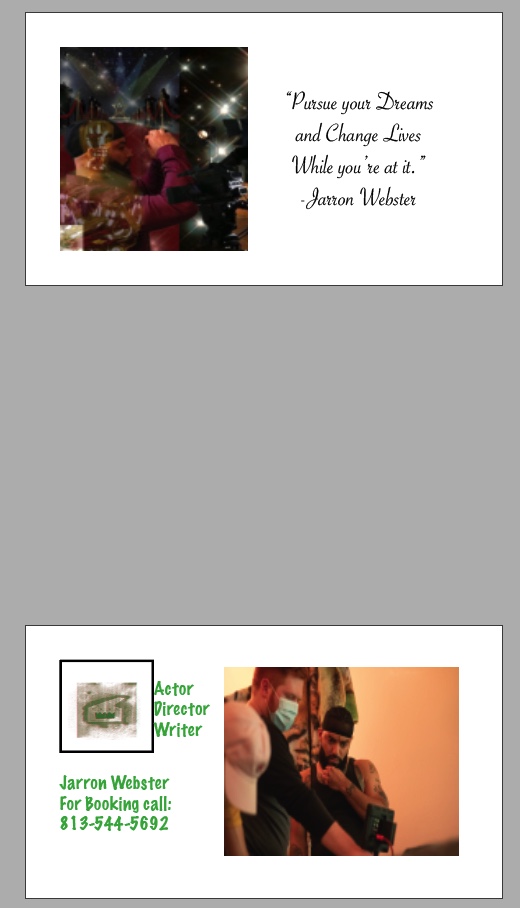
I made my business cards using my theme of being a creator in the film industry. I am an Actor, a Director, and a Writer. I am extremely passionate in the freedom that is provided by being a creator. Our art is our art, our interpretation, and our decisions. Being able to create is such a beautiful gift and a phenomenal opportunity. I made my business cards using a mixture of different photos. One is my headshot, which would likely play its role best promoting my actor side. Another picture I used is actually my autos copy project. I believe it is a great display of my personality and how I envision my role in this artistic world. I also have a photo I used with me in action of directing a film. My logo is the CR8R logo that was made for class. I used this in simple manners. On two of my cards I put it on the back as a standalone representation of my brand. On one card I put it on the front and an added appeal to the card when looked at from the front view. I did my best to make m...
These are the three tutorials I liked most for InDesign. They are pretty straightforward and direct in their approach. The information provided is quiet clear and it seems as if what we've been getting prepared for this the whole time we've been in class. There are a lot of similarities with the tools in the other programs we worked with. However, the tools and how to use them to their fullest will likely be the biggest challenge in accomplishing tasks in the program. Tools like effects will take some getting used to when figuring out their full capabilities. Learn Adobe InDesign in 9 MINUTES! | Formatting, Tools, Layout, Text Etc. | 2020 Beginner Basics - YouTube Learn How to Use the Basic Tools in Adobe InDesign CC | Dansky - YouTube Get Started with 10 Beginner Tips for InDesign - YouTube
My autoscopy project is almost a literal view inside my mind. I’d like to call it something like “Visions”. The picture that I put up of myself is a picture of me actually directing my second film. It says a lot about where I’m at when I’m in my element of film making. I constantly have visions of film circumstances and scenes that I see as I experience life. I almost never stop thinking about creating. I used the red carpet picture because that’s where I envision myself after completing works of art. I used the picture of the award because I absolutely envision being awarded for my efforts in what I accomplish. The picture of the stars relate to that same vision. The film equipment photo is basically being on set doing what I love. This photo has a lot of significance when it comes to my thought process.


I think this came out great. I love the green you used and your logo. I think it all works together really well. Great job:)
ReplyDelete