Posts

Business Cards

Image
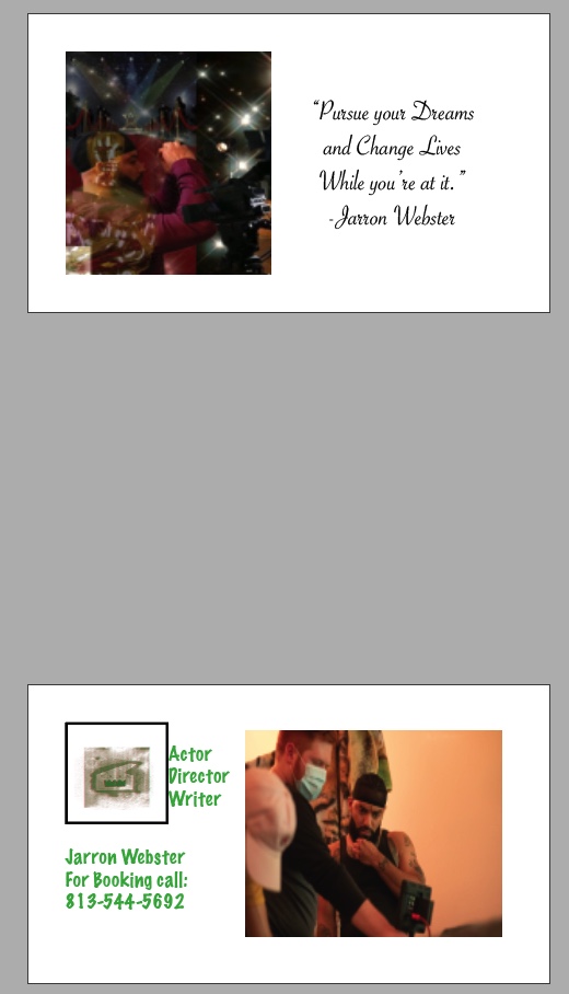
I made my business cards using my theme of being a creator in the film industry. I am an Actor, a Director, and a Writer. I am extremely passionate in the freedom that is provided by being a creator. Our art is our art, our interpretation, and our decisions. Being able to create is such a beautiful gift and a phenomenal opportunity. I made my business cards using a mixture of different photos. One is my headshot, which would likely play its role best promoting my actor side. Another picture I used is actually my autos copy project. I believe it is a great display of my personality and how I envision my role in this artistic world. I also have a photo I used with me in action of directing a film.  My logo is the CR8R logo that was made for class. I used this in simple manners. On two of my cards I put it on the back as a standalone representation of my brand. On one card I put it on the front and an added appeal to the card when looked at from the front view. I did my best to make my bu

Blog Post for InDesign links

  These are the three tutorials I liked most for InDesign.  They are pretty straightforward and direct in their approach. The information provided is quiet clear and it seems as if what we've been getting prepared for this the whole time we've been in class. There are a lot of similarities with the tools in the other programs we worked with. However, the tools and how to use them to their fullest will likely be the biggest challenge in accomplishing tasks in the program. Tools like effects will take some getting used to when figuring out their full capabilities.   Learn Adobe InDesign in 9 MINUTES! | Formatting, Tools, Layout, Text Etc. | 2020 Beginner Basics - YouTube Learn How to Use the Basic Tools in Adobe InDesign CC | Dansky - YouTube Get Started with 10 Beginner Tips for InDesign - YouTube

Autoscopy

Image
My autoscopy project is almost a literal view inside my mind. I’d like to call it something like “Visions”. The picture that I put up of myself is a picture of me actually directing my second film. It says a lot about where I’m at when I’m in my element of film making. I constantly have visions of film circumstances and scenes that I see as I experience life. I almost never stop thinking about creating. I used the red carpet picture because that’s where I envision myself after completing works of art. I used the picture of the award because I absolutely envision being awarded for my efforts in what I accomplish. The picture of the stars relate to that same vision. The film equipment photo is basically being on set doing what I love. This photo has a lot of significance when it comes to my thought process.   

Propaganda Poster

Image
For my propaganda assignment, I decided to use a self-portrtait of myself that didn't really convey any emotion aside from seriousness. The depth of my message is a serious one so I wanted to have a poster that represented the same. It's called American skin because of the two Americas I personally feel like we live in. A social issue we've had as a country is the difference in the treatment of black humans vs. white humans by law enforcement. It's an issue that seems to bring forth major controversy, when in reality it's as simple as there being an injustice done unto a certain group of humans in America. There have been numerous killings of black citizens who have been unarmed and not shown any type of threat. When on the other hand, there have been numerous white citizens who have literally carried automatic weapons after killing innocent people, and the cops handled these individuals with care. it's just a pure injustice that none of us in this country s

Portrait

Image
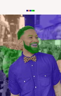
I chose the portrait of myself when I was visiting New York. It was a very dynamic and cultured place. People from every walk of life is what it seemed. I chose the brighter colors I did because that's how I kind of felt being there around so much diversity. I felt alive, I felt like I was surrounded by acceptance and humanity. Everyone looked as if they were happy and full of joy. So I used oranges, greens, and blues to create my art on this portrait. Those colors seemed fitting for how I felt being engulfed with that moment.

Photoshop tutorials

The three photoshop tutorials I looked at were all different. They all seemed fairly simple once you get the hang of the software. I think getting the hang of the software and knowing what tools do what will be the biggest challenge overall. The payoff to learning these things and maneuvering through this software will be learning a new skill that has endless potential. The best thing about Photoshop is the many capabiities it has. You can create, manipulate, and do so much more. I'm looking forward to the photoshop journey. https://youtu.be/Q2E1npU5xmk https://youtu.be/O4DMvPhFclI https://youtu.be/uOUXDipWeN8

tag brush logo

Image
The colors I decided to use with my brushed logo were green and red. Red because it is symbolic for passion and the green along with it because it helped bring forth a great 3d type of look.